by fh3onqao | Jun 20, 2024
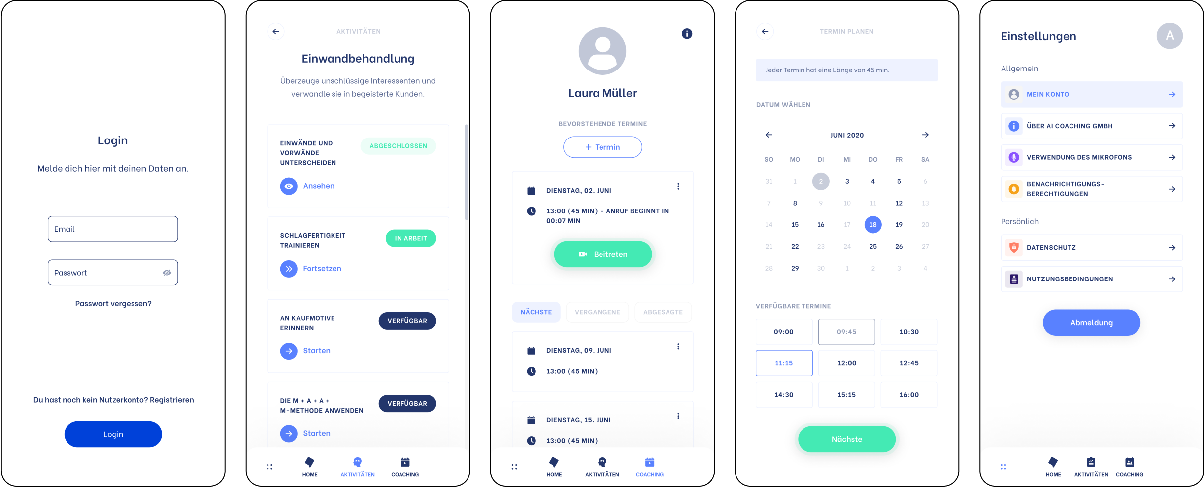
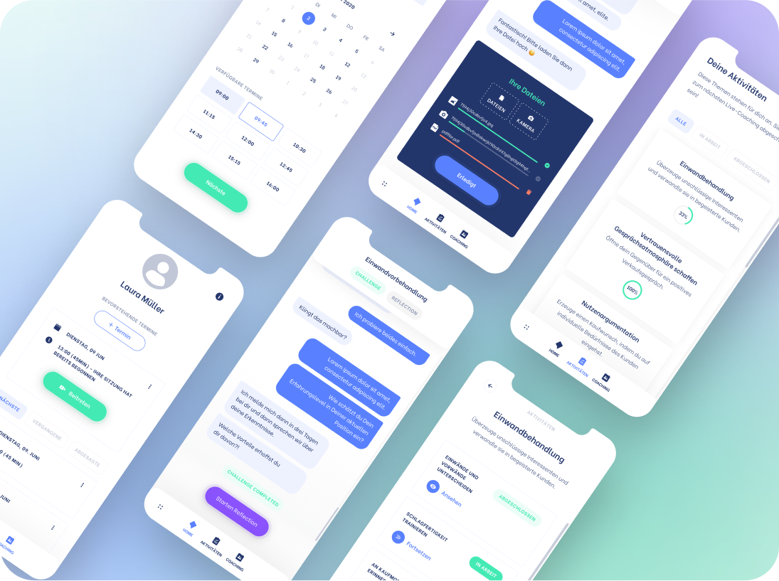
A Machine Learning digital Health Coach, designed to help sales professionals tackle mental health struggles and professional growth
Summary
Alongside the co-founders, I helped define the vision for the MVP solution to help make sales coaching engaging and accessible.
Role
Product Designer
Senior Product Designer
Offer
0-1 design of the mobile web application
Responsability
End-to-end design
Team
+ Myself
+ 1 Full-stack Software Engineer
+ 1 Machine Learning & Data-Science Engineer
+ 1 Data-Science Manager (Co-founder)
+ 1 Linguistic Psychology Expert (Founder)
Sector
B2C SaaS — Digital music notation composition
Skills
+ Roadmap Planning
+ PM Assistant
+ Solution Definition
+ User Interview Prep
+ Information architecture
+ User Personas
+ User Flow Mapping
+ User Experience
+ Visual Design
+ Interaction Design
+ Design System
+ Usability Testing
+ QA
Thanks for the visit.
Reach out and let’s chat!

by fh3onqao | Jun 20, 2024
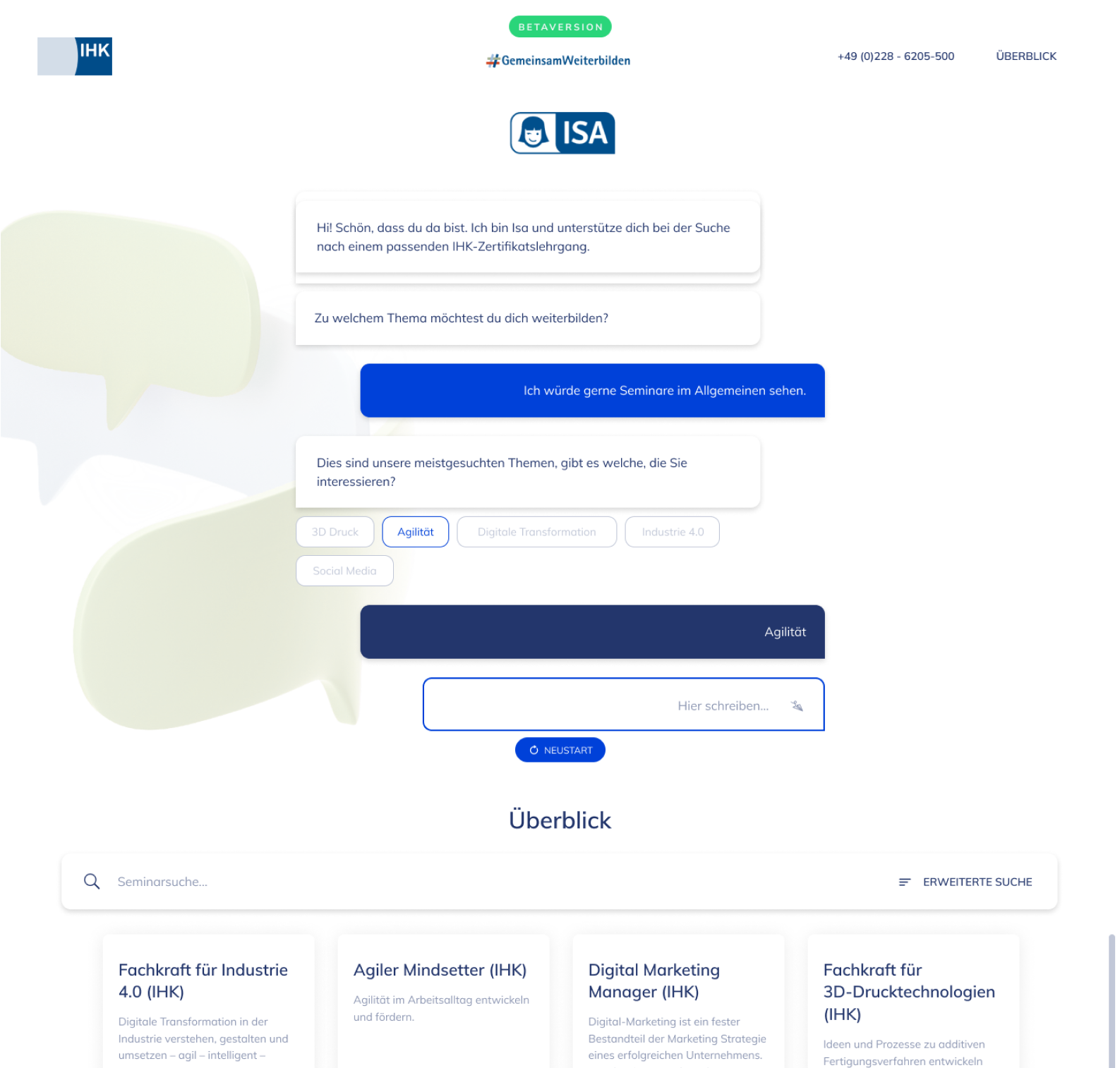
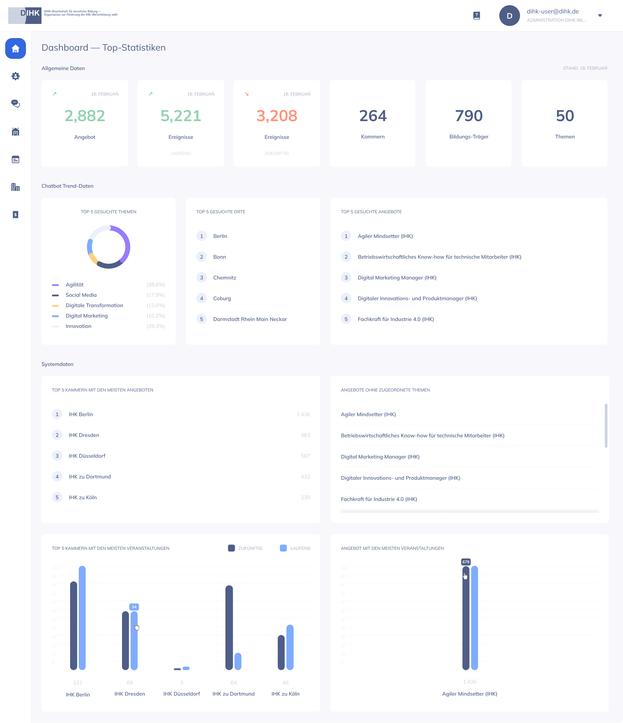
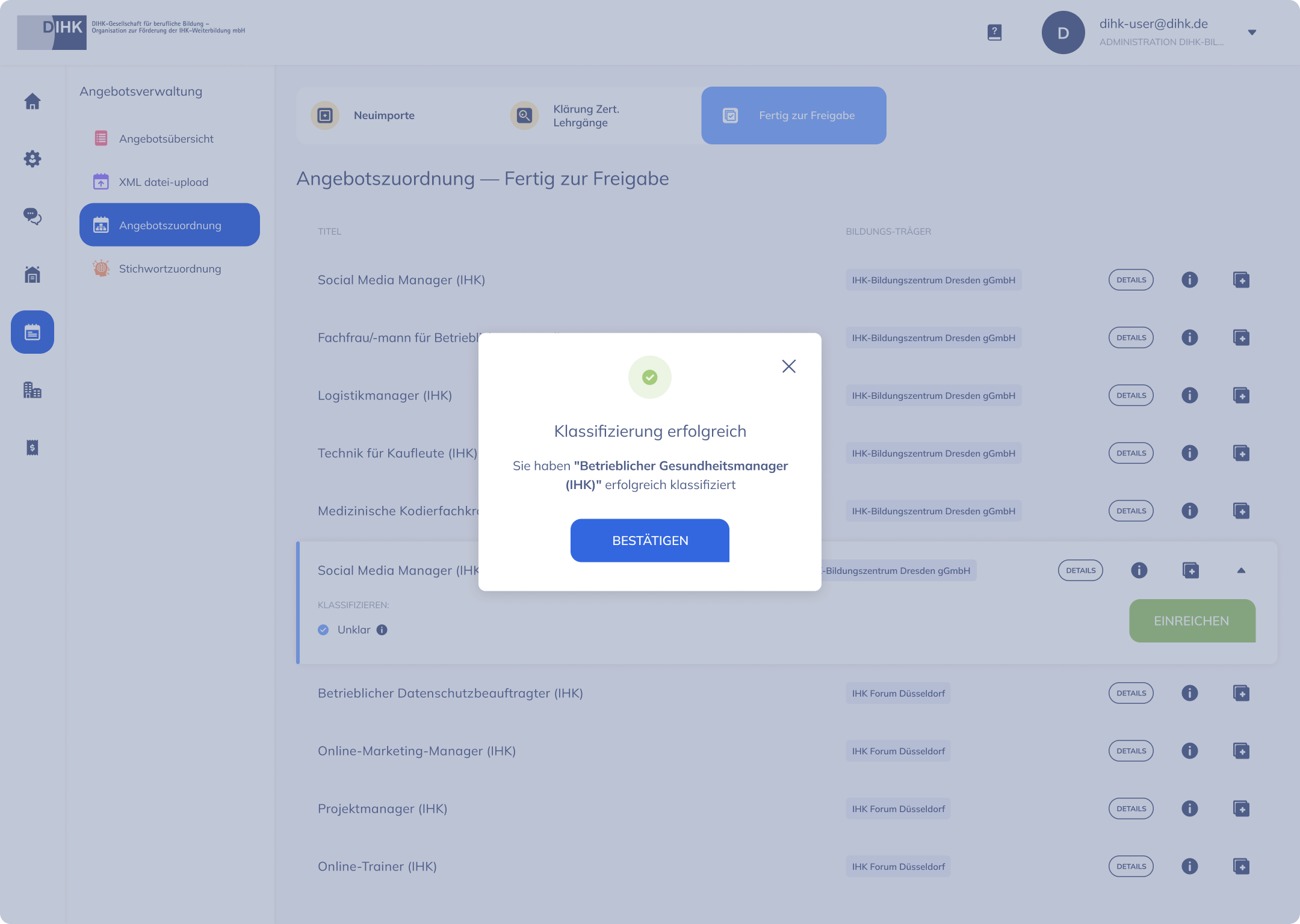
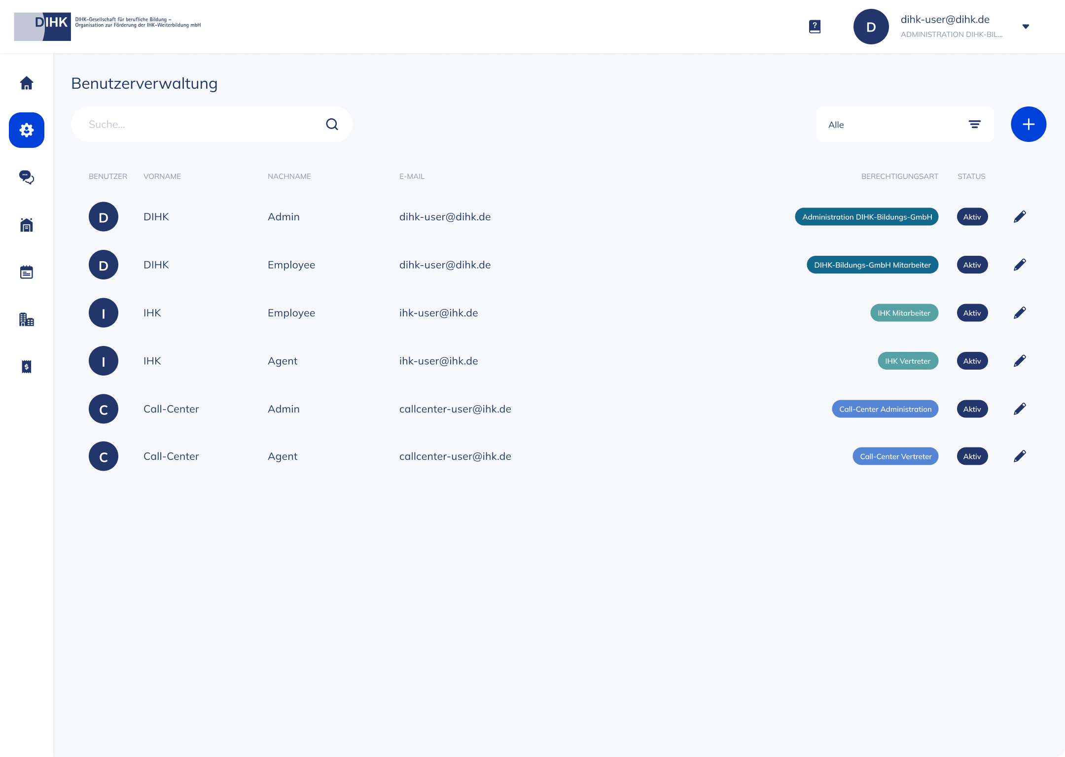
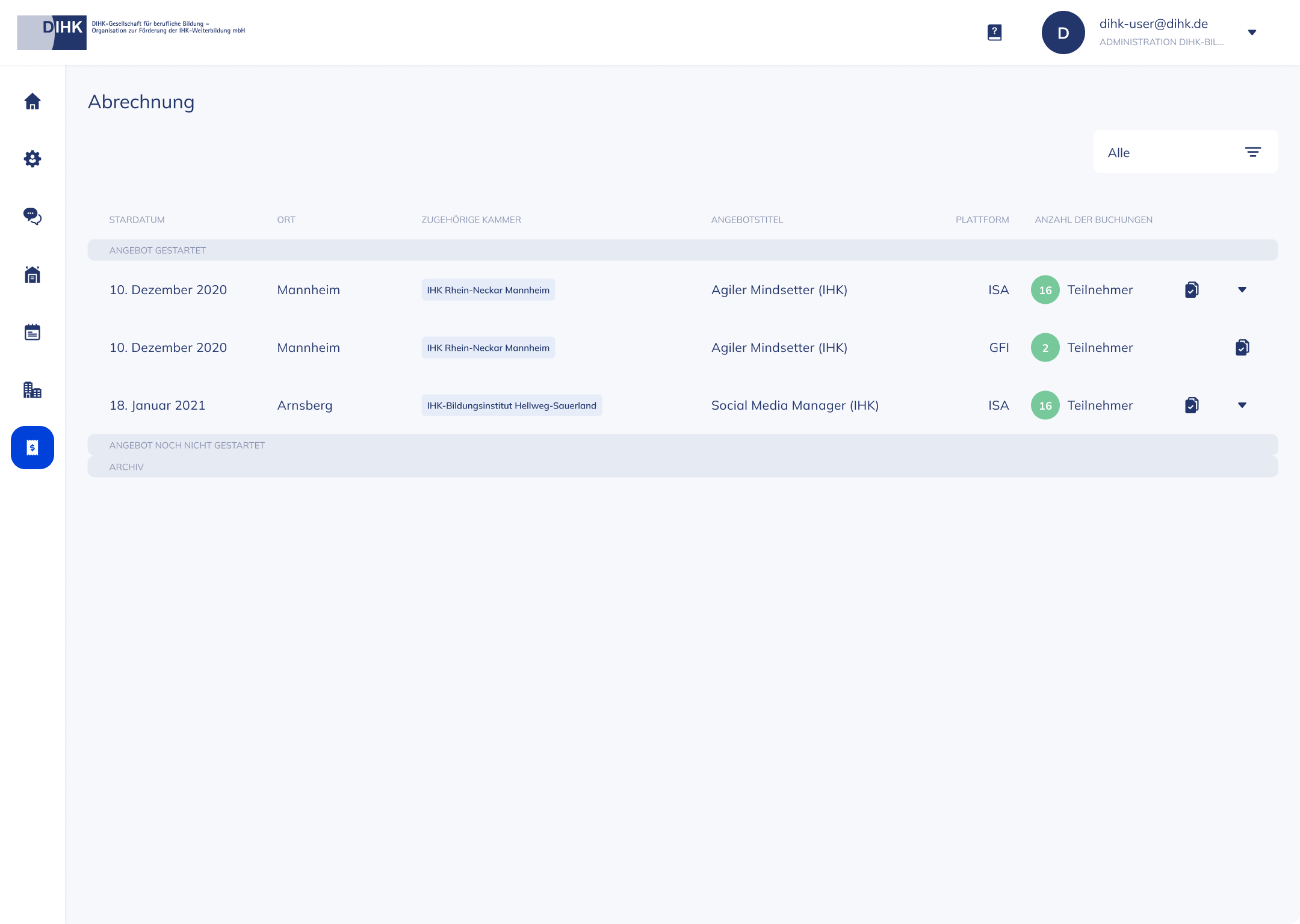
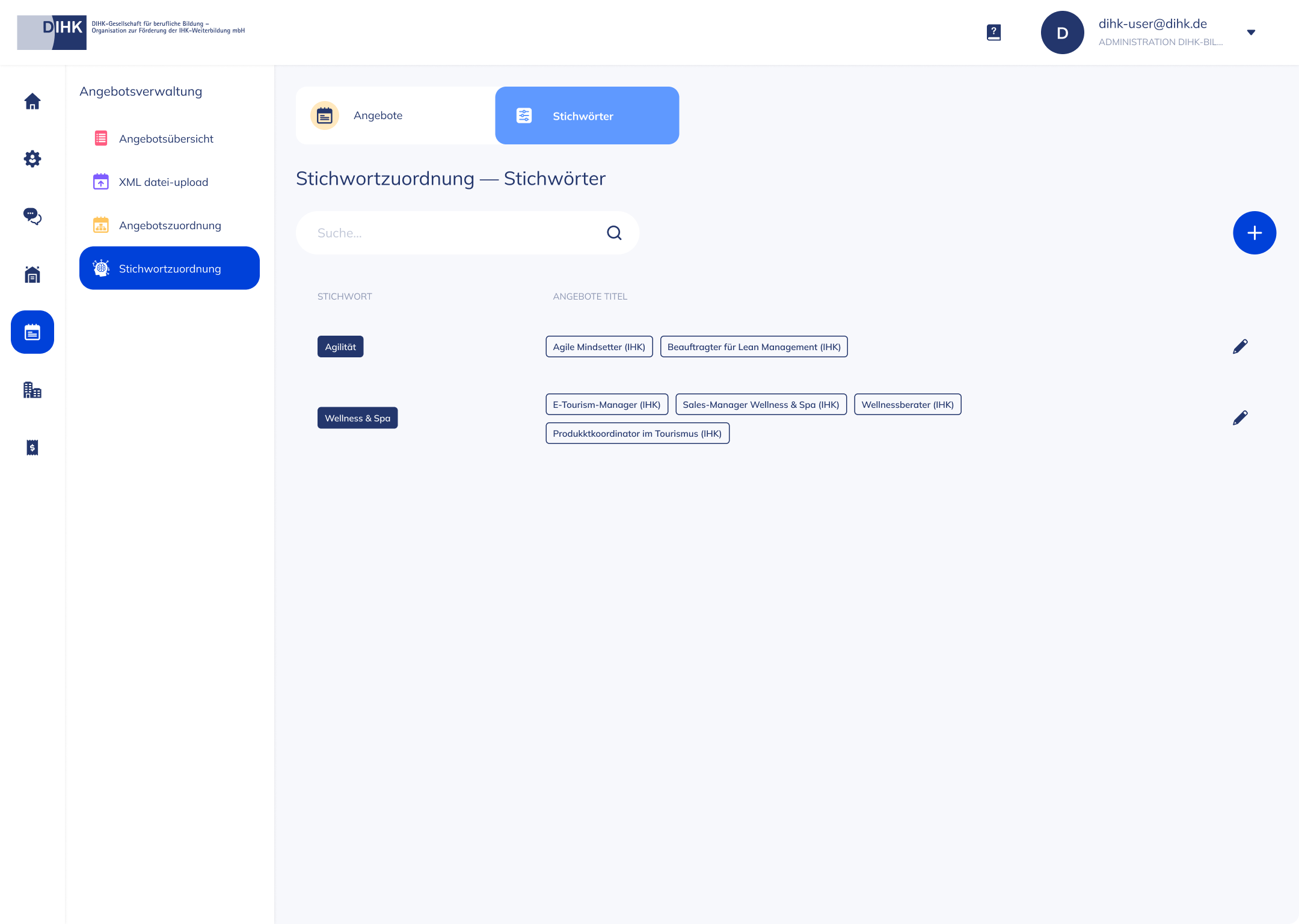
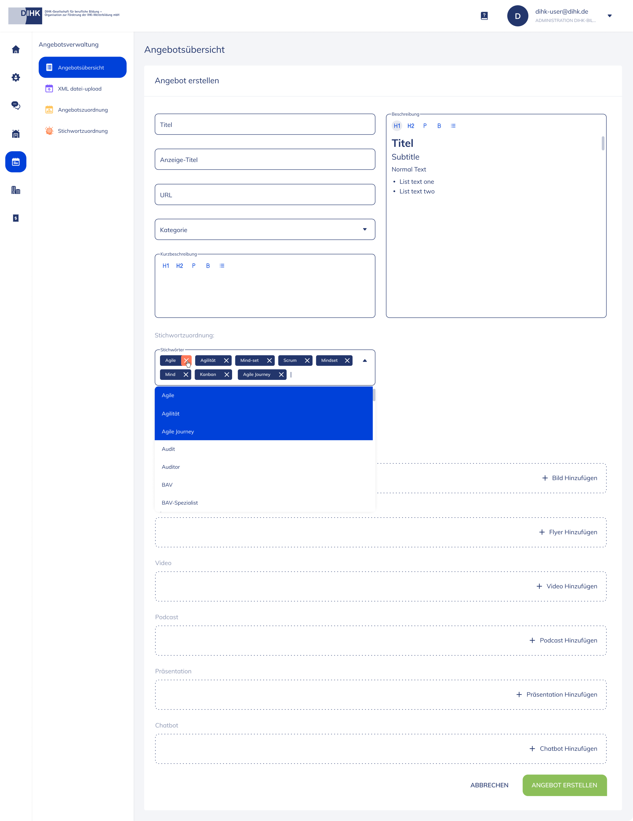
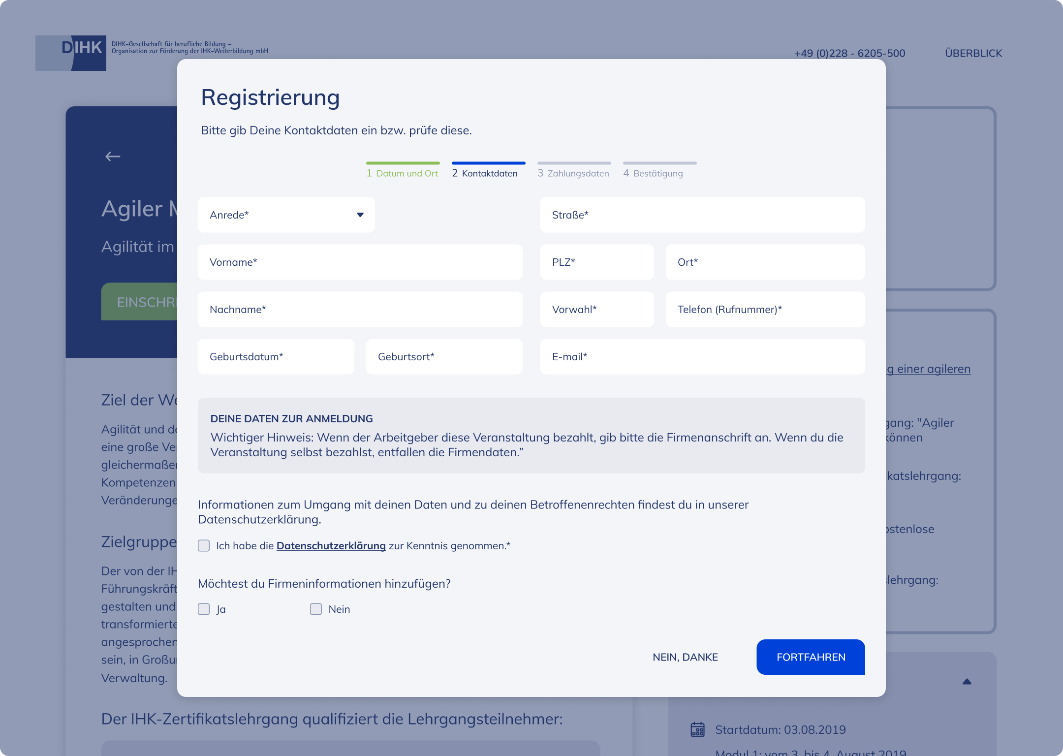
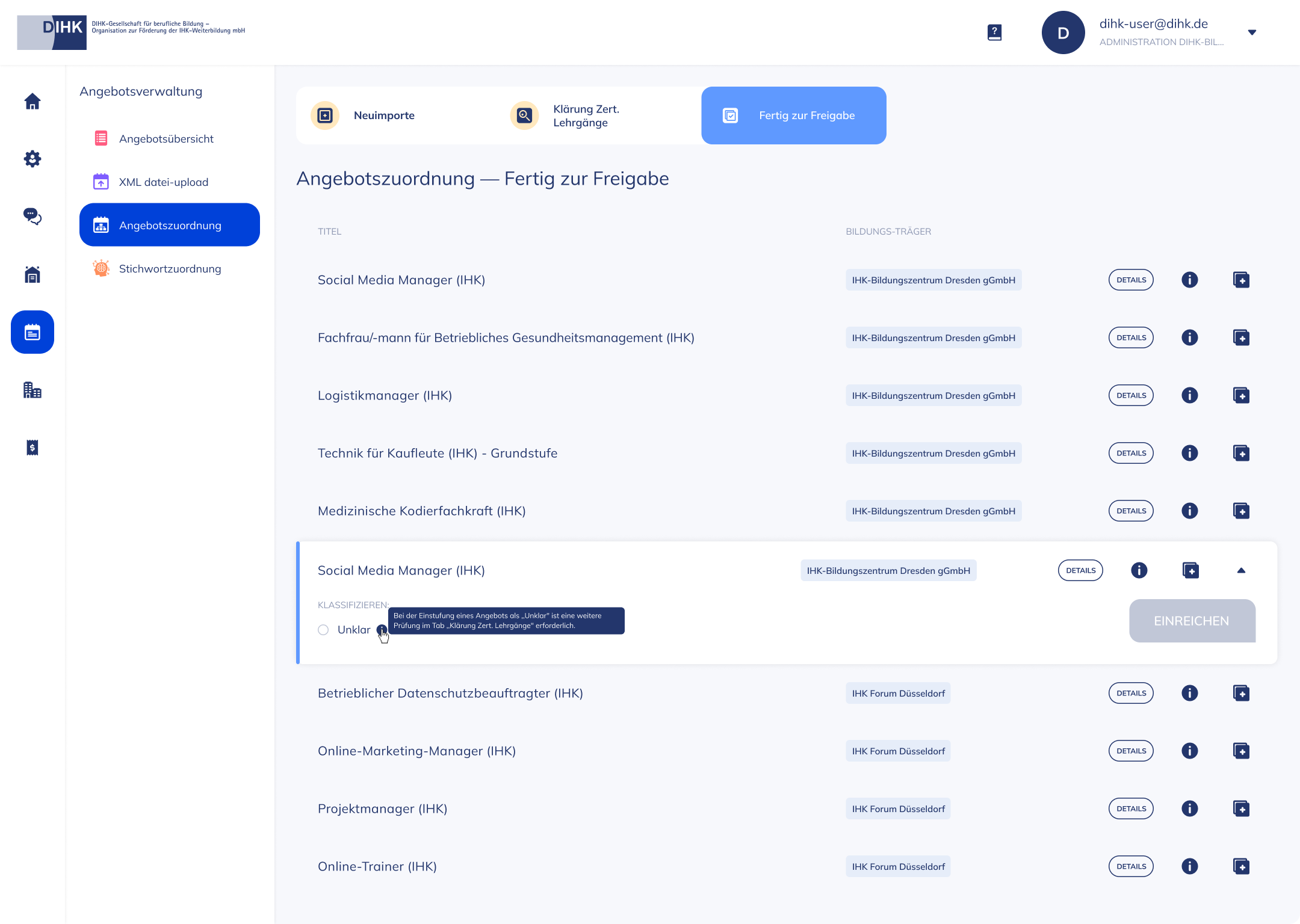
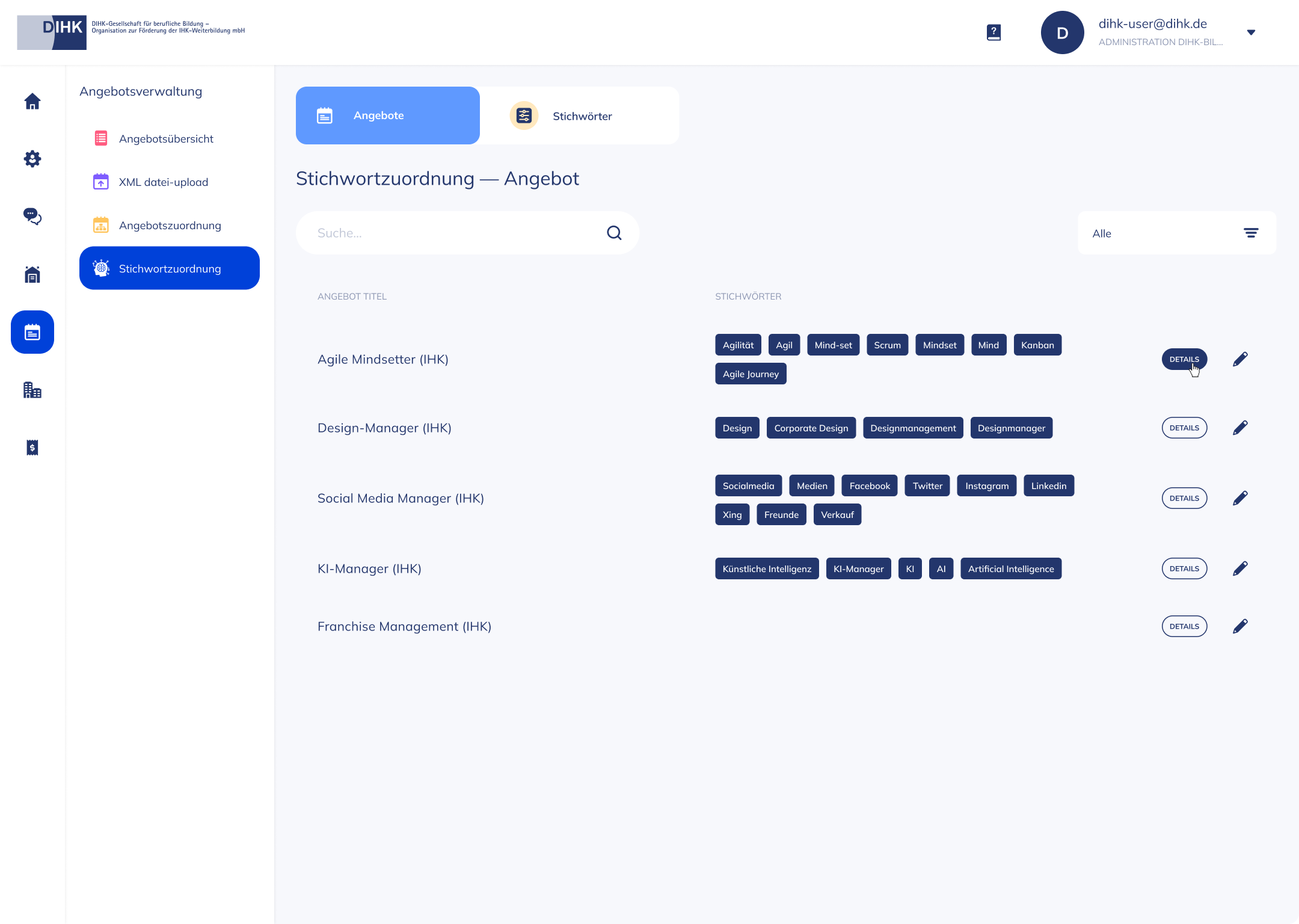
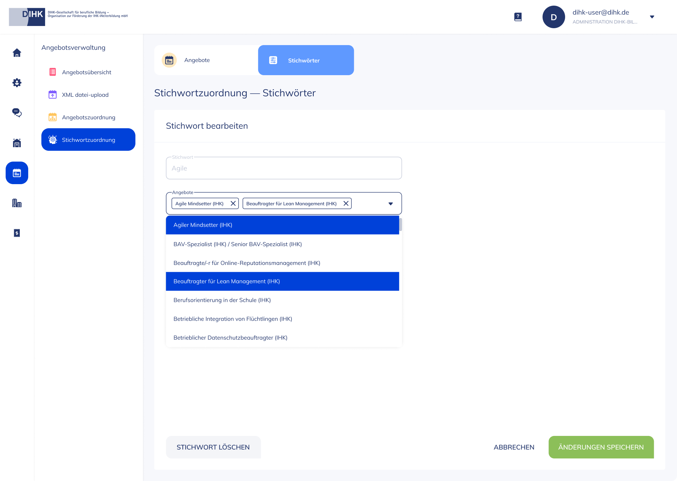
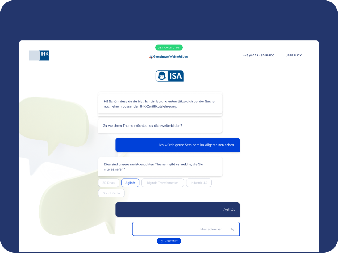
Performance improvement of the search of digital certifications offered by the 74 chambers of Industry and Commerce (IHKs)
Summary
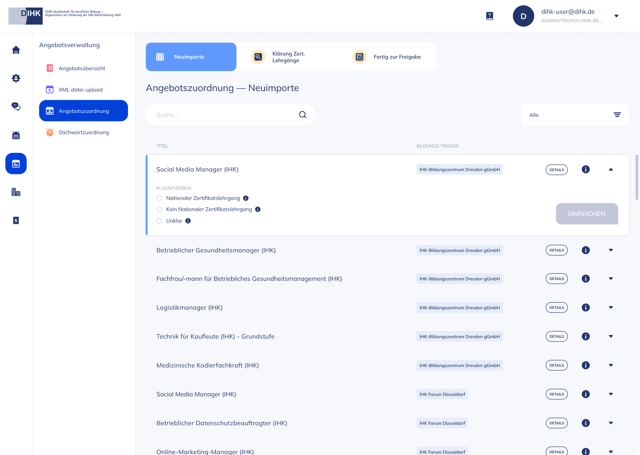
Led the design and collaborated in the definition of the product vision for the innovative AI chatbot search interface solution, aiming to create a single source of truth and unified platform for all nationwide and non-nationwide digital certifications offered by 74 Industry and Commerce Chambers (IHKs) within the German Chamber of Commerce (DIHK).
Role
Product Designer
Senior Product Designer
Senior Product Designer
Senior Product Designer
Senior Product Designer
Senior Product Designer
Offer
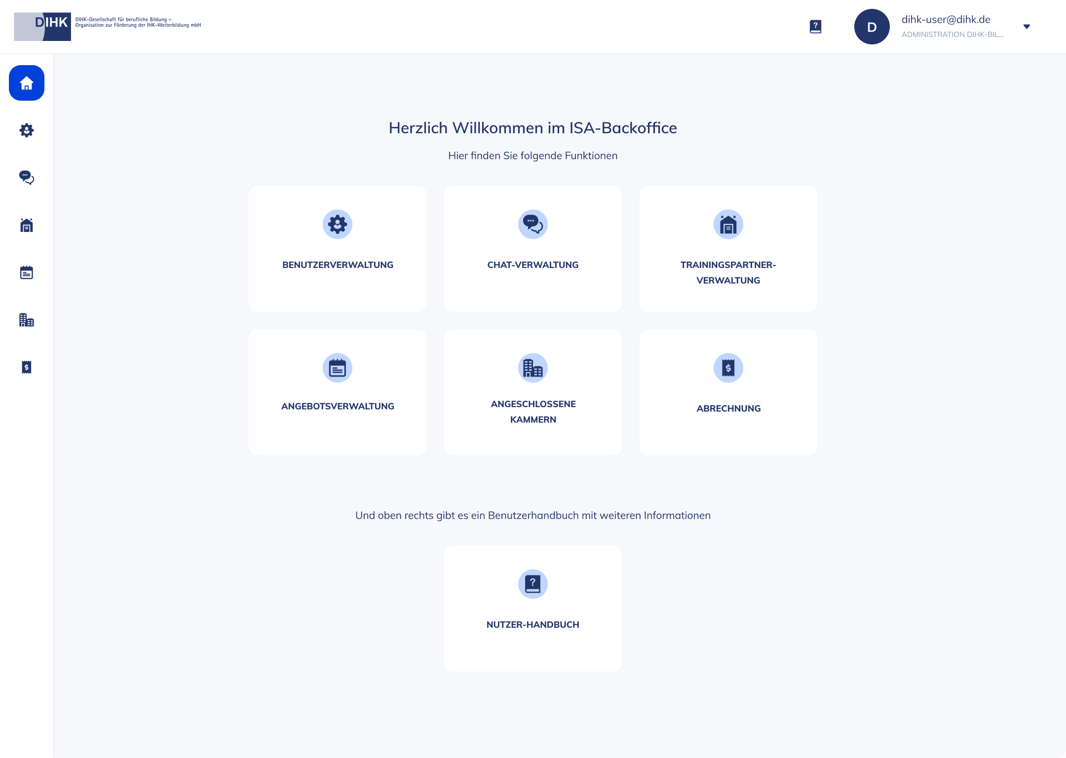
0-1 design of the SaaS web application customer-facing and internal back-office system
Responsibility
End-to-end design (The project has since been discontinued and is now a part of ISA which I designed the initial version at the time).
Team
+ Myself
+ 1 Full-stack Software Engineer
+ 1 Machine Learning & Data-Science Engineer
+ 1 Data-Science Manager (Co-founder)
+ 1 Linguistic Psychology Expert (Founder)
+ DIHK Manager
Sector
B2B and B2C SaaS — Legal & Commerce Chamber
Senior Product Designer
Senior Product Designer
Senior Product Designer
Skills
+ Roadmap Planning
+ PM Assistant
+ Information architecture
+ User Flow Mapping
+ User Experience
+ Visual Design
+ Interaction Design
+ Design System
+ QA
Thanks for the visit.
Reach out and let’s chat!

by fh3onqao | Jun 20, 2024
Increased user-engagement by +20% and instilled greater confidence for beginner and first-time users
Summary
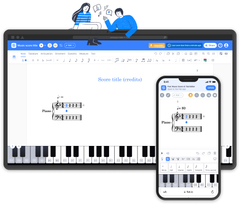
An onboarding system for the purpose of simplifying digital musical notation composition for beginner-friendly customers and first-time users part of the 5M+ global community of music lovers, growing engagement and increasing user-retention.
Role
Senior Product Designer
Senior Product Designer
Offer
0-1 design of the interactive onboarding tutorial for web, iOS and Android environments
Responsability
End-to-end design
Senior Product Designer
Team
+ Myself
+ CX Operations Manager
+ 2 Software Engineers
Sector
B2C SaaS — Digital music notation composition
Skills
+ Competitive Analysis
+ Onboarding Best Practices
+ Data-Inputs
+ User Experience
+ Visual Design
+ Design System
+ Interaction Design
+ Customer Journey
+ Usability Testing
Thanks for the visit.
Reach out and let’s chat!

by fh3onqao | Jun 20, 2024
UI Improvement Proposal to scale up and delight Flat’s 5M+ global community of music lovers
Summary
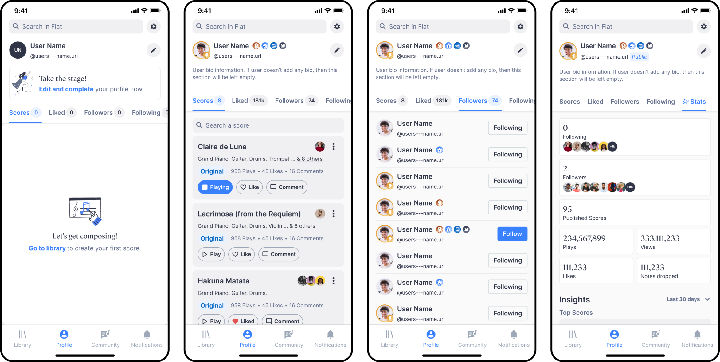
A more informative, conscious and user-centric approach for the customer-facing profile view features and functionality experience, seeking to improve the interactive journey of the out-dated interface of Flat’s iOS and Android native mobile apps, increase usability and familiar UX patterns, drive product consistency and grow user retention.
Role
Senior Product Designer
Senior Product Designer
Offer
Complete revamp of the UI, for both iOS and Android native mobile apps, in dark and light mode.
Responsability
End-to-end design proposal initiative
Sector
B2C SaaS — Digital music notation composition
Skills
+ PM Ownership
+ Platform audit
+ Solution Definition
+ User Experience
+ Visual Design
+ Design System
+ Use case-scenarios
Thanks for the visit.
Reach out and let’s chat!

by fh3onqao | Jan 18, 2024
Flat.io Core-feature Onboarding
SAAS B2C — WEB, IOS & ANDROID
Flat.io, a renowned music composition editor, offers a feature-rich platform for musicians and composers.
Despite Flat.io’s powerful capabilities, user feedback and analytics indicated a need for an improved onboarding experience to enhance user engagement, reduce the learning curve, and optimize user satisfaction.
Responsible for the end-to-end design of the onboarding testing & final versions
1 Costumer experience manager, 1 Lead Marketing strategist, 3 developers at Tutteo Limited
Users, although quickly adapting to Flat.io’s modern interface compared to other music composition software’s, reported challenges in fully understanding and utilising the score composition inputs and its advanced features, especially those new to musical composition.
Users didn’t have any kind of guidance on where to start or what to do, leading to a less-than-optimal user experience, hindering user retention and limiting exploration off the product’s potential.
Improve user understanding, encourage exploration and elevate the overall user experience?
Defining Success — Hypothesis
Implement a well-structured onboarding tutorial for Flat.io, providing users with a guided and interactive introduction to the platform’s core feature.
By incorporating an onboarding tutorial. We anticipate a notable improvement in user engagement, accelerated user proficiency and increased user satisfaction.
Empathise
Utilize feedback to tailor the onboarding experience, enuring it addresses the specific needs and preferences of different user segments.
-
- Improving the understanding and proficiency of users score compositions abilities, is likely to contribute to higher user satisfaction, reducing frustration and promoting a positive overall experience
Conceptualize
Create an interactive element to actively engage users in the learning process.
-
- Users who complete the tutorial are expected to achieve a quicker and more comprehensive understanding of the interface and composition tools
Strategize
Implement analytics to monitor user interactions and define KPI’s to understand user proficiency after onboarding.
-
- Users are anticipated to engage more actively with the onboarding tutorial, resulting in an increased exploration and interaction with the Editor’s features
Design
Develop a comprehensive onboarding tutorial that covers fundamental score composition input tools and functionalities.
-
- Crafting a carefully curated onboarding tutorial that addresses user onboarding challenges, fosters a more intuitive and enjoyable experience
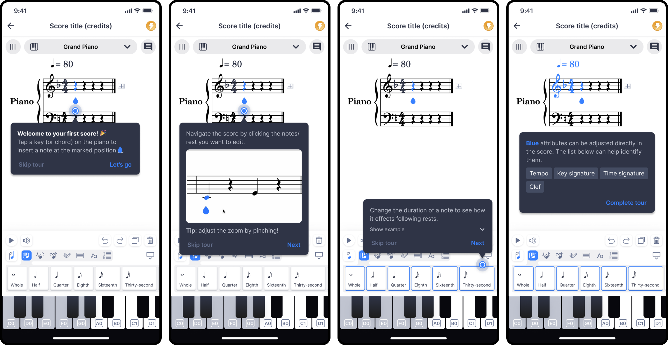
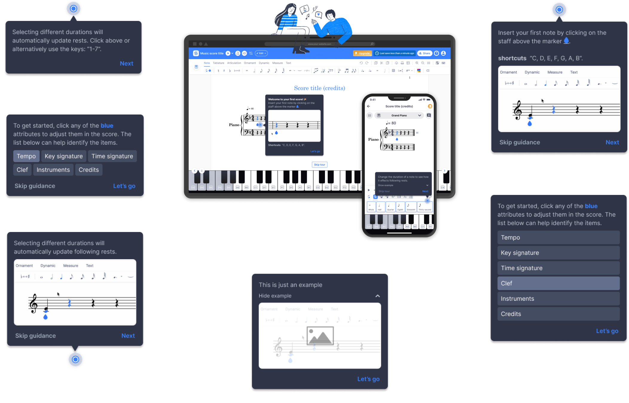
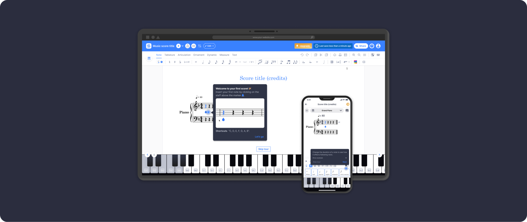
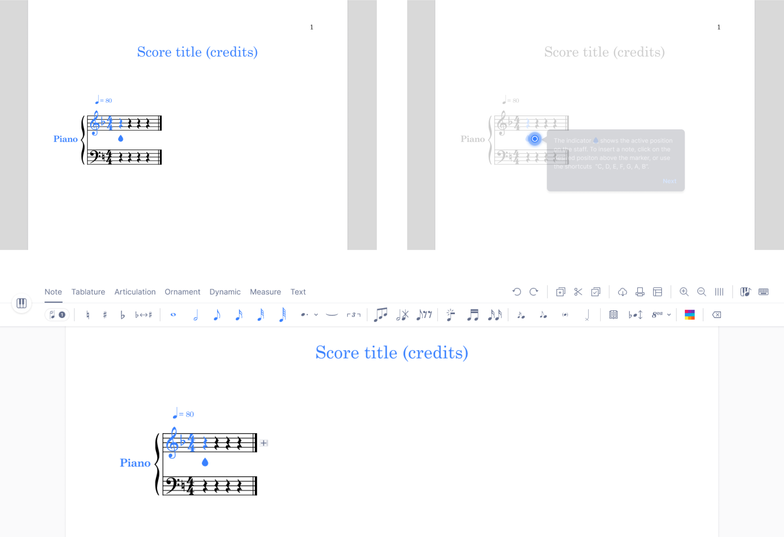
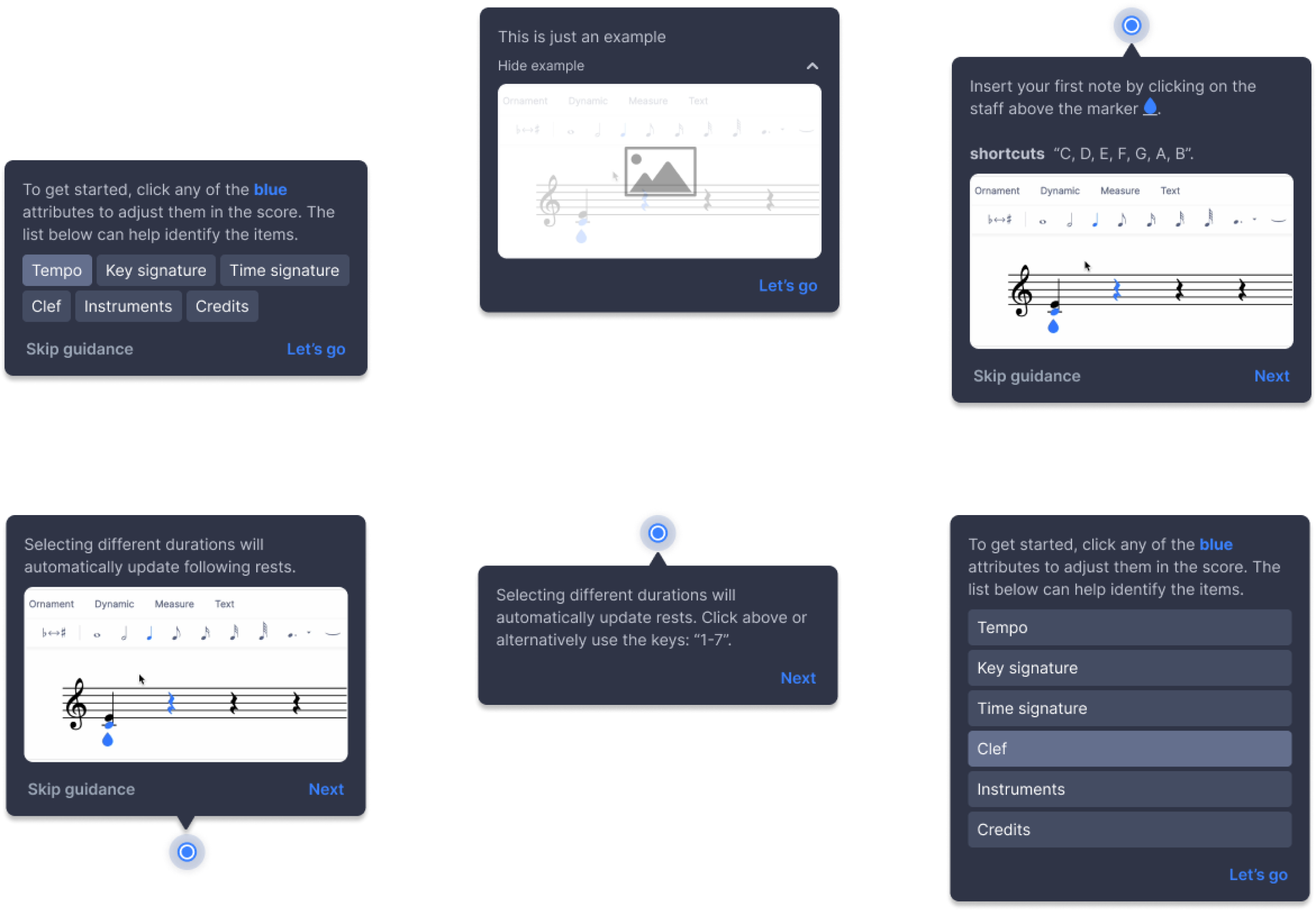
Example of tool highlights, light bubble and key features
Engaging, familiar patterns that support the product requirements and align with one of the companies core values of continuos commitment to improve the product experience with more user-centric solutions.
Keeping in mind the business core value of continuous commitment to improve the product with more user-centric solutions, we initially peformed user-interviews with the 3 types of personas we had identified (beginner, intermediate and advanced users) who had never used the product and were willing to try it on a live sessions for us to better understand how they perceived the product and what steps they took on the first-time composing. From the results and inisghts gathered from the interviews, we then explored the different key components we would need to focus on throughout the onboarding tutorial, such as:
-
- Tool highlights
- Light bubble
- Key features
After coming to a conclusion on the exploration of the component elements, we started performing A/B Testing to better understand if users preferred images, gifs, videos included in the tooltips; what features users spent a longer time on in the sessions, among others.
Design of the tutorial tooltip
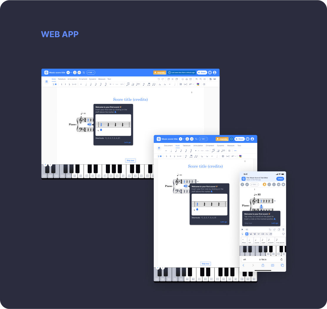
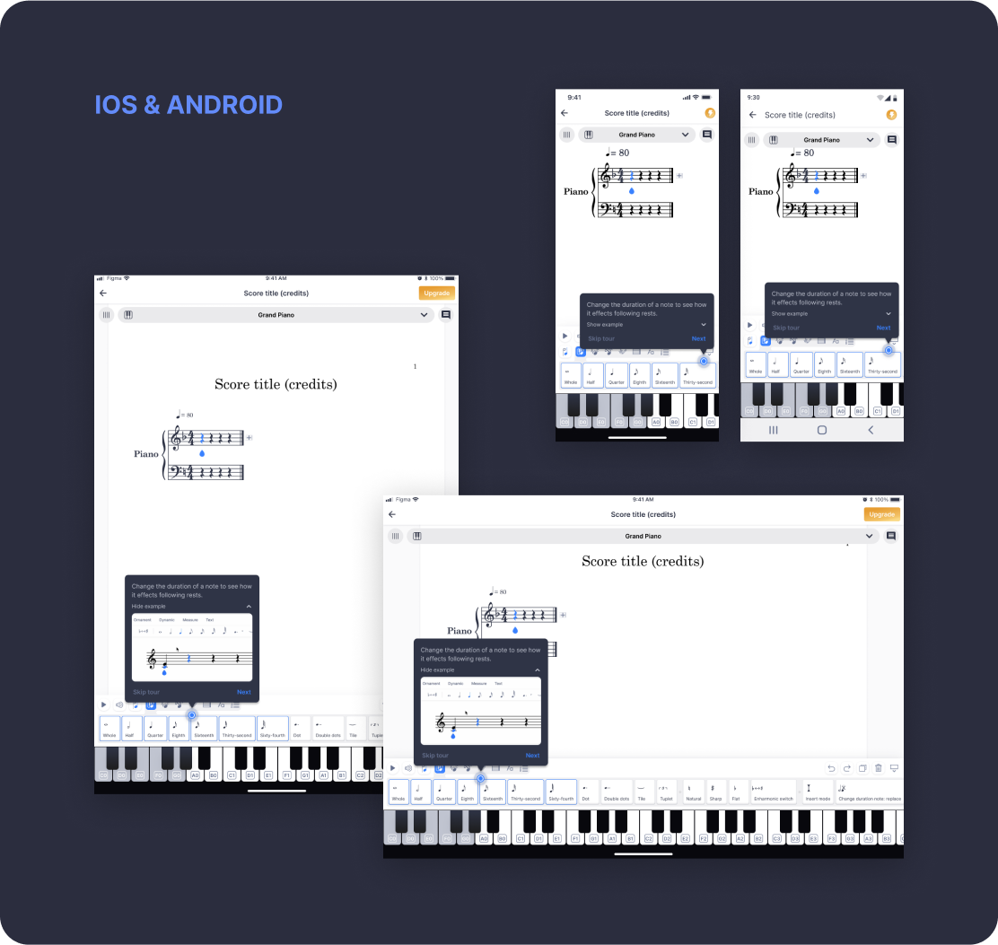
After following through with iterations based on the A/B testing and metrics we were collecting, we finally reached a first version of the onboarding tutorial focused on beginner users.
6 months later, in August of 2023 we have a successful onboarding tutorial in production, which is already generating conversation rates.
What went wrong?
In our initial approach we thought we should start out by showing all the score inputs and then leading the user to a guided mini-tutorial on how to input notes in the score.
We later realized that this section was where users spent the least time, and instead they were a lot more active with the guided tutorial.
↓ _____ More Selected Works _____↓
Mobile digital coaching management
Product Design / 2020
Seminar offers chat-bot platform
Product Design / 2019-20
Educational digital platform
Product Design / 2018
Cristina Tulcidas — 024©
Mais Amor Por favor
