Elevating UI design proposal to delight and increase engagement for Flat.io 6M+ global community of music enthusiasts

Role
Senior Product Designer. I led the project end-to-end, from initial exploration through to the final proposal presentation. My role included synthesising consumer feedback, conducting research, ideating, and designing for both iOS and Android native apps, supporting both light and dark modes. I closely collaborated with the web platform designer to ensure cross-platform consistency and worked with the brand manager to develop illustrations.
Platform
SaaS B2C | Digital music notation composition
Timeline
September — October 2023
Team
01 Senior Product Designer
01 Product Designer
01 Brand Manager
Deliverables
High-fidelity design
DS library components and documentation
Proposal presentation
Achievements
⚪
Consistent design
I updated and aligned components that diverged from the design system, ensuring visual consistency across platforms while redesigning existing elements and creating new ones.
🚀
Foundation for growth
I designed outcome-driven features to improve user experience and boost engagement with targeted calls to action and informative empty states.
Introduction
At Tutteo Limited, one of my primary responsibilities was to explore product improvements to enhance user engagement, increase retention, and boost activation rates, targeting product growth. As part of the annual strategy, our team identified the need to revamp the product, with a specific emphasis on improving the user experience across iOS and Android apps.
Discovery
Tutteo was transitioning into a scaling phase, refocusing efforts on user acquisition, activation, and growth. Key challenges included a redesign of the mobile apps, as retention rates were declining due to an outdated and inconsistent user interface.
Key metrics:
- Only 9% of sign-ups remained active after 2 months
- Only 2.2% of sign-ups were engaged after 2 months
An internal survey revealed valuable insights that guided the solution.
Survey results:
- Users highlighted the community section as the most beneficial feature
- At the same time, users pointed out the community section as the most needed area for improvement
- The “aha” moment for most users was the creation of musical scores
Mixpanel community research findings:
- The majority of users showed minimal engagement, such as creating a profile or making a single like, comment, or follow
- The most repeated actions within 7 days were following profiles, liking scores, and updating profile images
- 94% of paying users were likely to use the community, compared to only 4% of free users.
• Engaged users were more likely to use the community features (14% of paying users, 8% of free users)
Voice of customer report findings:
- Many users felt the app could be more intuitive and user-friendly
- Feedback indicated that while the web platform worked well, the mobile version (especially on iOS) felt clunky and difficult to use
Problem Space
The discovery phase identified:
⚠️ Low engagement retention as a key issue that needed urgent attention
")
In addition to the pain-points anointed in the image above, there are several other UX issues present in the visual interface:
- The blue background creates readability, legibility, and accessibility issues
- There is a lack of detailed information for both user profiles and score composition cards
Design
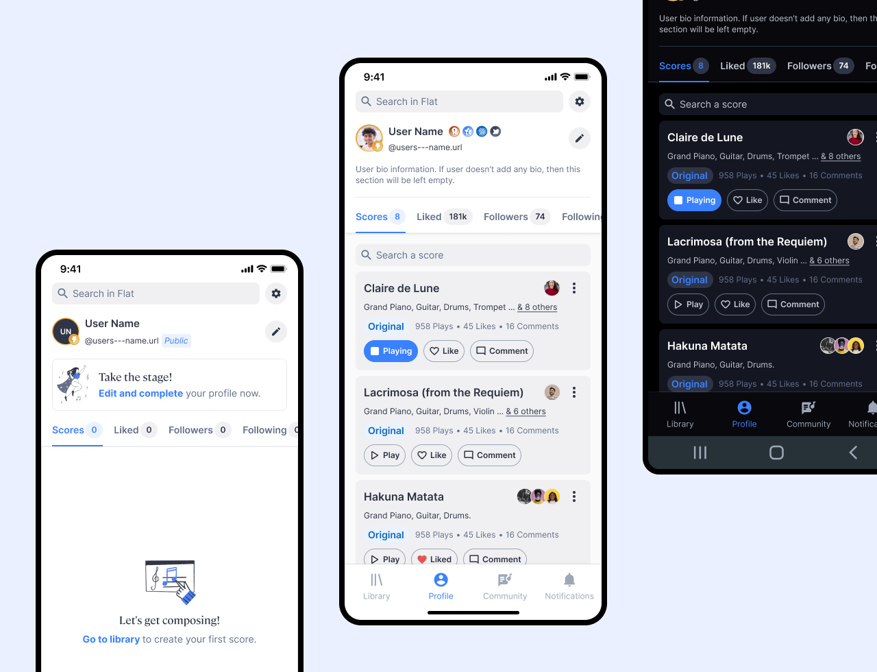
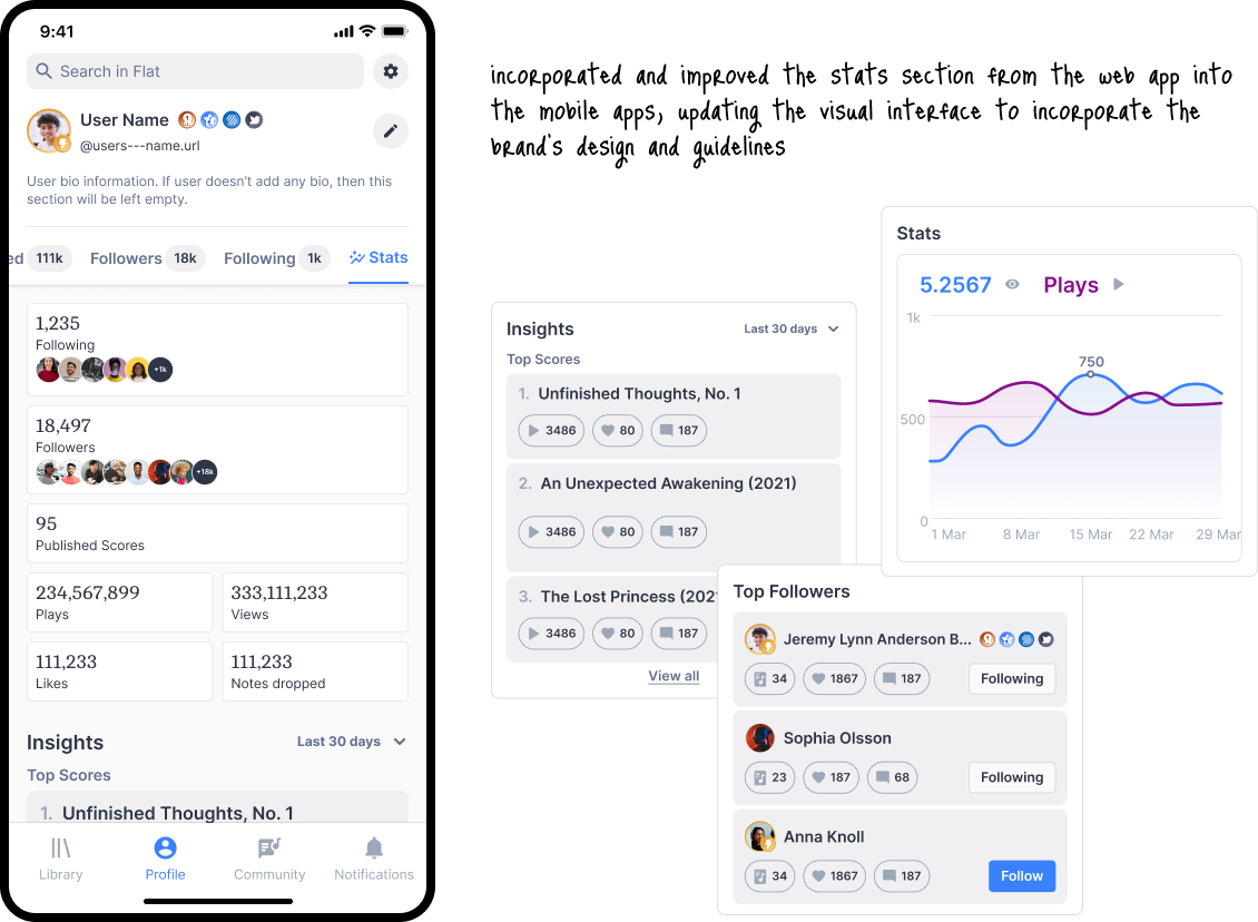
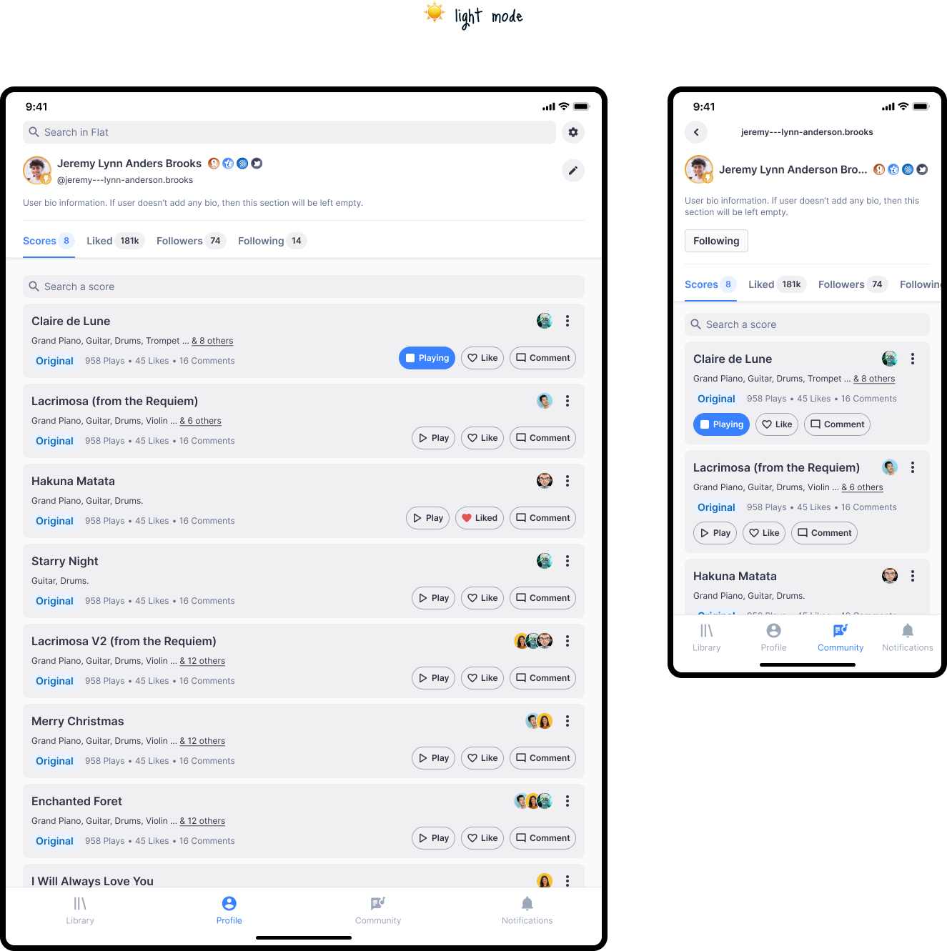
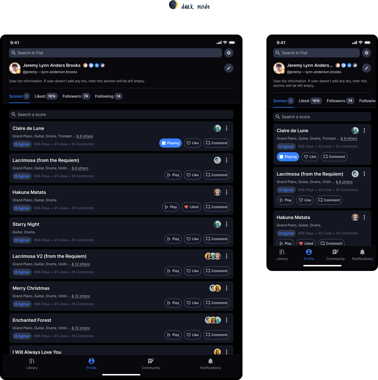
Following our annual company gathering, where team meetings were help in which we set our collective goals and objectives, I proposed starting the revamp by focusing on the user profile pages, for both personal accounts and community profiles.
The objective was to create a more engaging and consistent experience that would drive both activation and retention across platforms.
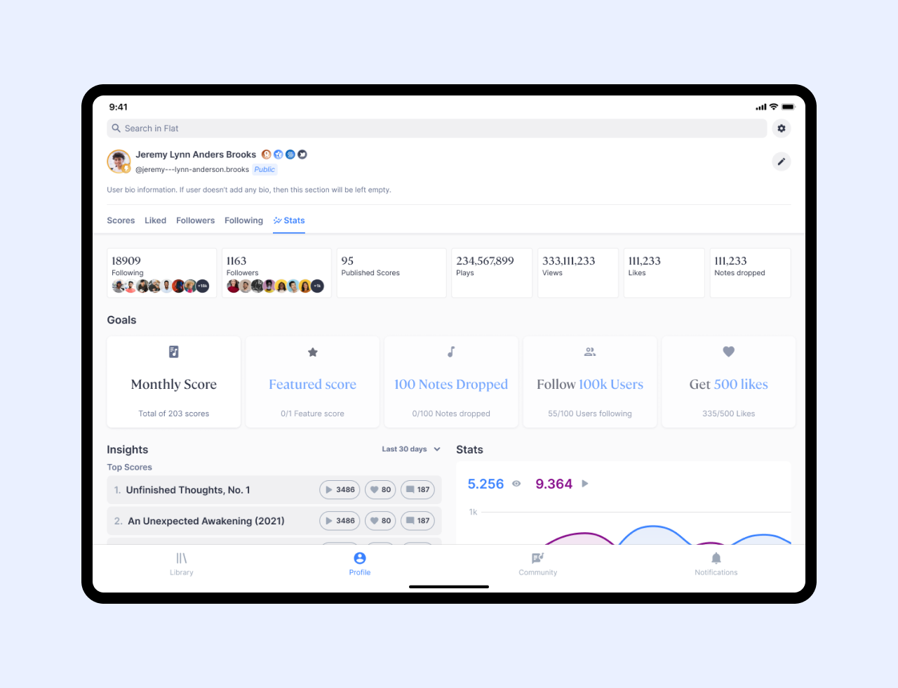
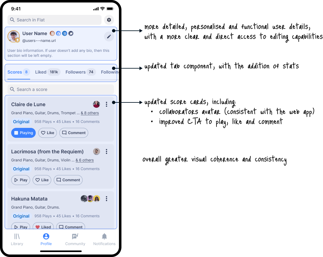
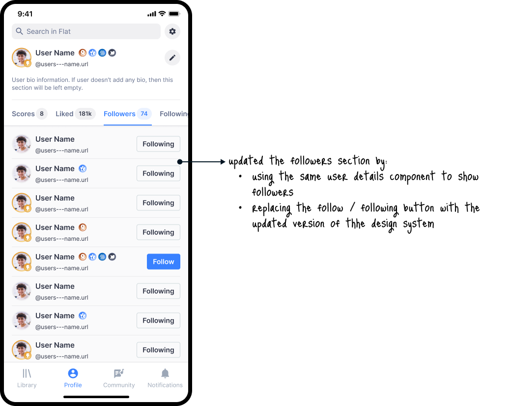
The final outcome focused on providing better system status information to the user, by:
- demonstrating the free / premium account status
- highlighting badge states visibility
- showing the username url
- allowing quick access to editing capabilities for the users own profile
- showing score collaborators
- improving play, like and comment CTAs in the score composition cards
- displaying all instruments of a score composition
- showing the number of played times, likes and comments a score composition has
- highlighting the user profile stats (number of scores, liked scores, follower and following)
- modernizing and updating the outdated visual of the interface to improve readibility, legibility and accessibility
Process
Given the scope of this task, it was crucial to adopt a collaborative approach, as it involved multiple teams across different squads.
Although I was responsible for overseeing the project, I partnered with the web platform product designer to ensure consistency across mobile and web apps.
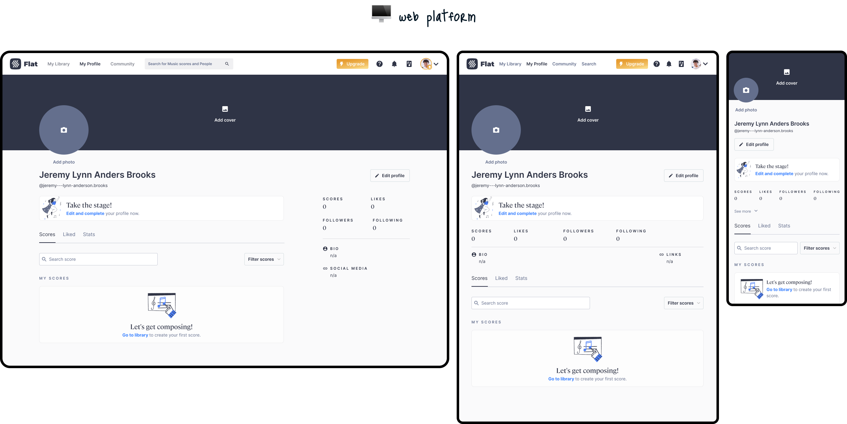
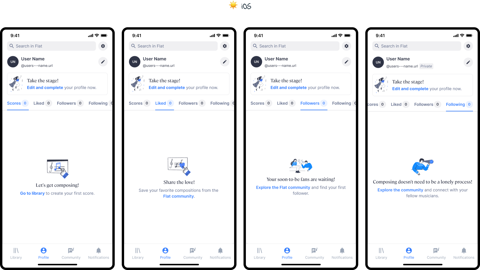
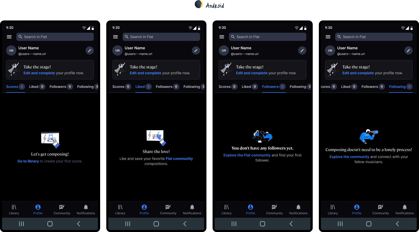

We also worked with the brand designer to develop new illustrations.


Collaboration with the iOS and Android developers was critical to address platform-specific constraints and optimize for different screen sizes.

Input from community managers provided essential feedback that helped identify pain points and areas of improvement for community profiles.

Outcome
While the redesigned product could not be fully rolled out within the project timeline due to the engineering teams workload, a plan for implementation of a first iteration was evaluated and drafted.
The focus was on ensuring a continuous and incremental deployment of design improvements, where there would be less of visual discrepenacies between the outdated version and the new redesign, which we could measure throughout the process and observe the impact on the user experience and make necessary adjustments based on user feedback, until the full-scope of the redesign could be rolled-out.

Although the implementation was still pending at the time, I created a plan that ensured the groundwork for a thorough post-launch evaluation was well defined.
Phase 1
- Adapted version between the outdated style and the new redesign, where we could already start measuring for better user satisfaction and engagement rates.

Phase 2
- Beta release, launching the redesign in light and dark mode to a select group of users. This would allow us to gather more in-depth feedback and address any unforseen usability issues before the full-scope release.
")
Phase 3
- Full release, incorporating insights gathered from the adapted version and feedback from the beta release. To aid the release, a marketing campaign should be implemented to highlight the new visual interface and new features and functionalities, projecting to drive user curiosity and increase engagement.

Defined metrics for success
- Retention rate: tracking the percentage of users who remained active after one month of using the new design, targetting an improvement of at least 10%
- Engagement metrics: monitoring community interaction, such as profile views, number. oflikes given, comments made and followed profiles, aiming for a 15% increase of community engagement
- Onboarding flow completion: measuring how many users completed their profile page on their first session, with the goal of increasing completion rates by 5%
- User satisfaction: user testing and nps ratings would be conducted post-launch to evaluate user sentiment and satisfaction with the updated design.
Learnings
Reflection on the challenge
Throughout this project, I gained valuable insights into the importance of:
- user-centric design: prioritising user reseach and feedback throughout the design process is crucial for creating products that truly meet user needs
- cross-platform consistency: ensuring a consistent user-experience across different platforms (iOS, Andoird and Web) is essential for maximising user engagement and satisfaction, which was something that had been somewhat neglected during my time at Tutteo up until this point
- collaboration and communication: effective collaboration with cross-functional teams (design, development, brand, marketing, operations) is fundamental for delivering successful product launches, communicating constraints, planning effective roadmaps and defining iterative solutions and metrics for success
The key take-away I take from this project is to consistently collaborate and communicate with team members and stakeholders, as this was something I failed to do so in the earlier stages of the project, which ended-up in a discussion around the workload accounted for on the engineering side. We were able to reach a middle-ground with the adapted version to roll-out on an initial stage, but I realised, that in sharing smaller chunks of the design process with the team would have better prepared for the entire scope of the project and lead to a better planning of the roll-out strategy (which was defined at a later stage in the process).
Currently open for
Cristina Tulcidas — 024©